LEGO® Classic Space Logo comparison
Here we look at three versions of the classic space logo on minfigure torsos.
Step 1 was to take a photo of three torsos.

Step 2 was to trace the outline of the three logos.
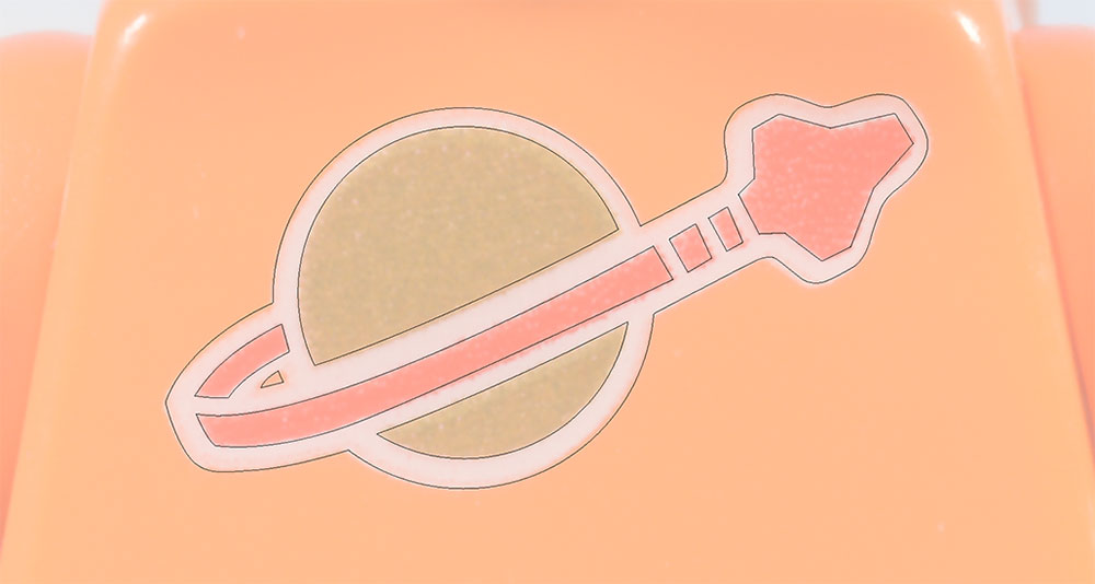
While the logos on the orange and purple torsos appear to be identical in size, orientation, and general overall composition there are two notable differences:
- The white layer of the orange torso’s logo has a small void between the planet and the rocket trail on the lower left. This void is not present on the purple torso’s logo.
- The white background of the purple torso’s logo has voids under the rocket trail and the interior of the planet.
Based on the tracings and visual comparison, here is what I believe is the print layering on the orange and purple torsos.
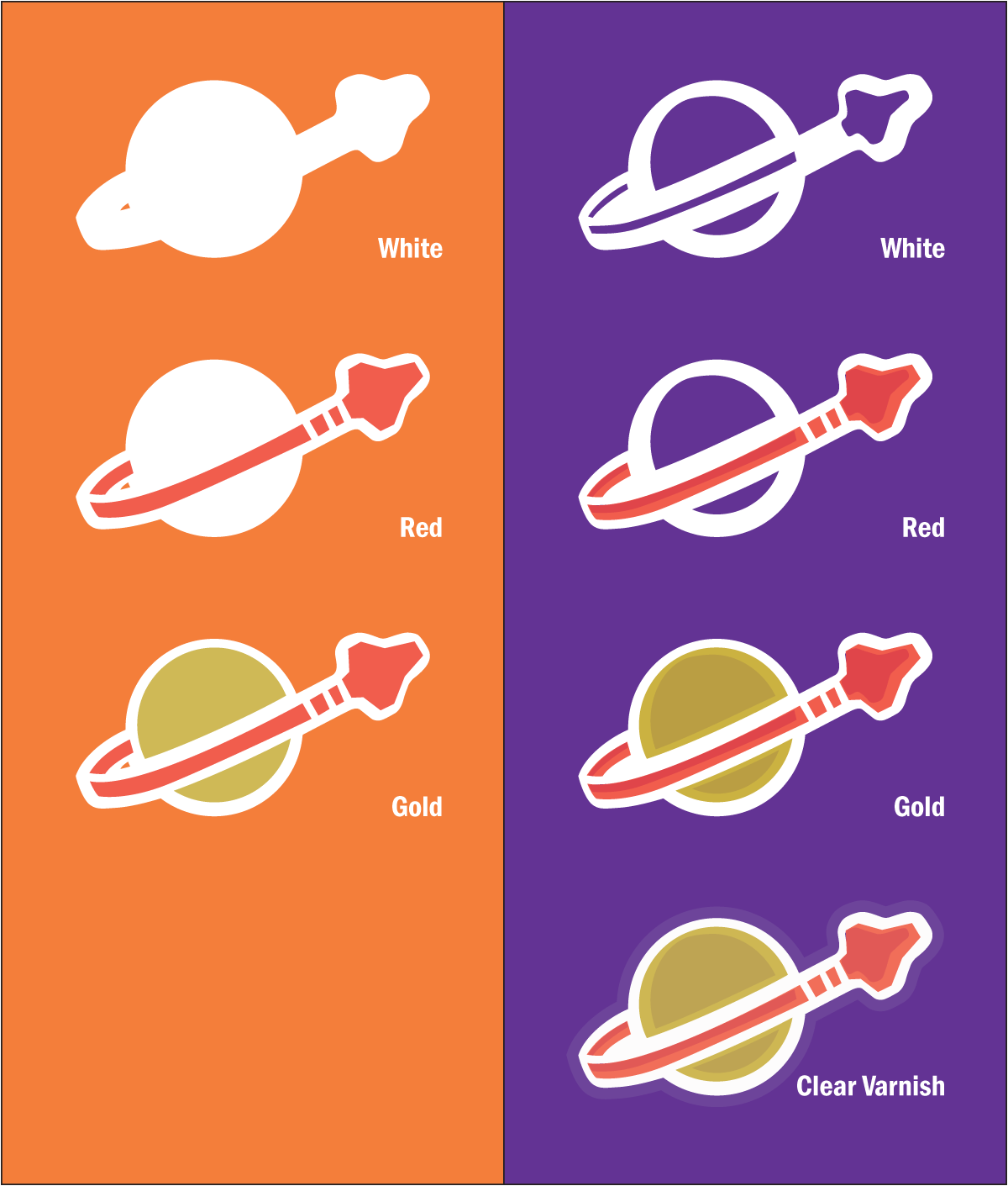

White ink is laid down first, followed by red, and gold. The purple torso gets an additional layer of clear varnish. This accounts for the faint outline around the purple logo.
Closer inspection of the orange torso’s logo looks like it may have a second layer of white ink in a pattern similar to the white layer of the purple torso. It would be not uncommon in printing to have two layers of white atop a colored substrate to prevent the effect that we see evident in the planet portion of the purple torso’s logo.
As orange is fairly close in value to the gold used here and extremely close in both hue and value to the red, the presence of orange in the underlayment would be relatively difficult to discern, especially compared to purple which is dissimilar to gold and red in both hue and value.
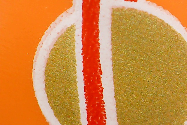
It is further possible that there are two layers of white on the purple torso as well, and the two layers are not identical.
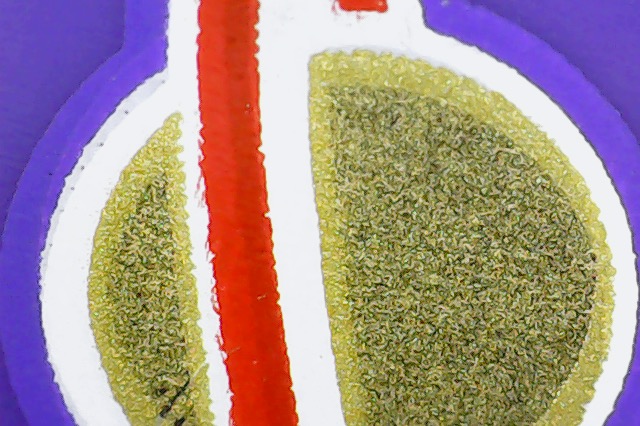
Regardless of the layering of the white ink under the other colors, it is clear that the two designs are different insofar as the design on the orange torso has the void on the outside of the planet and the design on the purple torso does not.
Moving on to the yellow Classic Space torso.
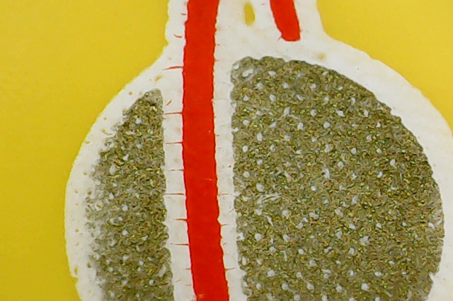
The print layering of the yellow torso’s logo is similar to that of the orange torso’s logo being solid white topped with red and gold. The waffle pattern evident in the gold application is a printing technique used to help prevent blemishes from occurring when wet ink is laid on perhaps-not-completely-dry ink. This pattern is likely also occurring in the white and red layers…note the dots in the spaceship…but if the ink was sufficiently heavy on the print head it would bleed out into the little white voids and the end result would appear as a solid.
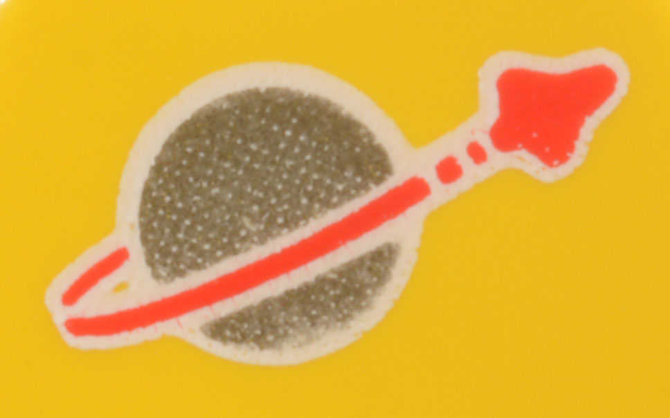
I don’t see any evidence of there being a second layer of white on the yellow torso’s logo.
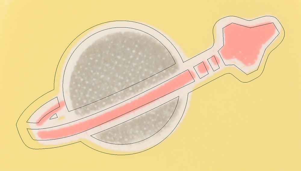
The image below shows the outline of the logo from the orange torso superimposed over the logo of the yellow torso without resizing. The orange torso’s logo is larger.
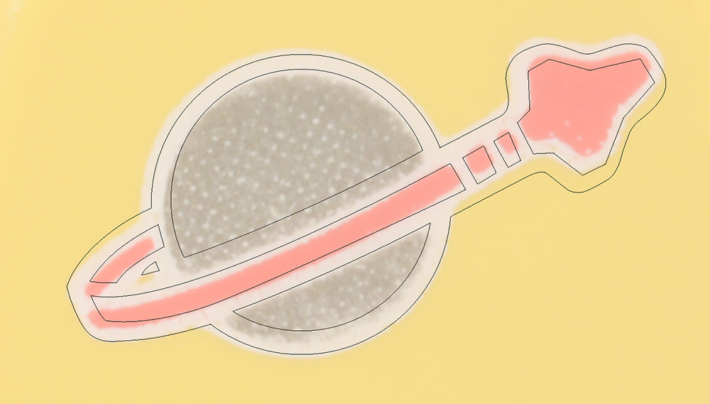
The image below shows the outline of the logo from the orange torso superimposed over the logo of the yellow torso where the overall width of the orange torso’s logo is reduced to match the width of the yellow torso’s logo. Here it is evident that the width of the spaceship’s trail is wider on the orange torso’s logo.
The image below shows the outline of the logo from the orange torso superimposed over the logo of the yellow torso where the overall width of the orange torso’s planet is reduced to match the width of the yellow torso’s planet. From this image it is clear to see that the both sides of the outline around the spaceship and its trail are relatively wider in both height and width on the orange torso’s logo. It is also evident that the angle of the long red line of the spaceship’s trail is steeper on the yellow torso’s design.

Comments
It is my suspicion that the layer of varnish is added to protect the gold which is notorious for fading and/or wearing off. This layer of varnish can be seen on other contemporary minifigure torsos.
Conclusion
While similar, there are three different iterations of the classic space logo present in these three figures.
