Black card trick versus Photoshop
I saw your tutorial about putting black cards up to letterbox your picture. Certainly it will make the raw picture better, but if I am using Photoshop in post will the finished picture really be better?
Yes. Here’s why.
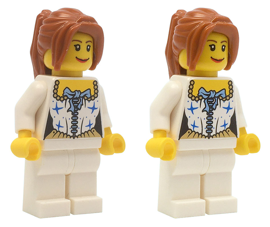
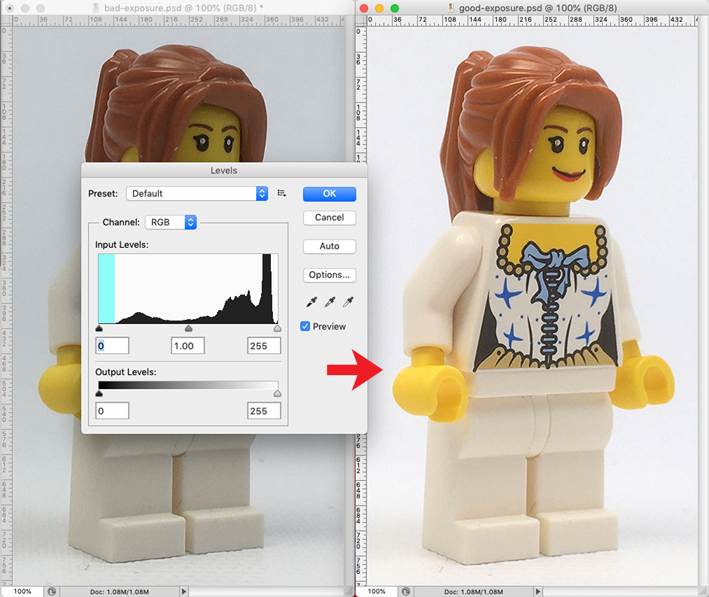
Above are the two shots from the earlier how-to. If no image adjustments are made and the photos are simply silhouetted, it becomes immediately clear that the bad exposure looks even worse in comparison because the contrast between the figure and the background is elevated.
Comparison
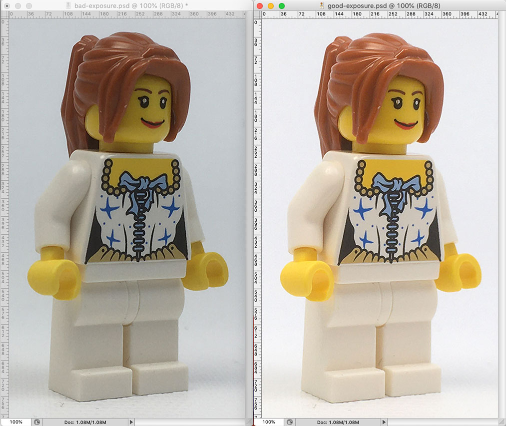
Compare the data in the two shots using the histogram in Photoshop’s Levels dialog box. Understand that the black “mountains” represent the distribution of pixel data in the shot. Dark or black values are represented at the left or “0” end and the light or white values are represented at the right or “255” end. As this shot is primarily white, being a white figure on a white background, there is the expectation that those lighter values would represent heavily on the right end of the distribution.
Viewing the graph for the bad exposure, note the absence of data at both ends of the spectrum as indicated with blue in the graph below. There's a lot of data in the middle region. If “0” on the scale represents 100% black and “255” on the scale represents 0% black (white), it can be stated that the bulk of the data lies between 25% and 50% black. The picture bears this out; the background is objectively a middle gray value.
Viewing the graph for the good exposure, more data appears in the light end of the range. There are many different light colored pixels in this image compared to the bad exposure. This means more and subtler detail in the high value range. There is little data in the dark range, and hardly any in the middle range. There are actually very few middle gray values in the shot...the hair being the most noticably middle value. There is a very small uptick at the very far right end of the graph, most likely these pixels are the hard white highlights on the upper corner of the torso. Note there were no pixels at all in this higher range in the bad exposure.
Adjustments
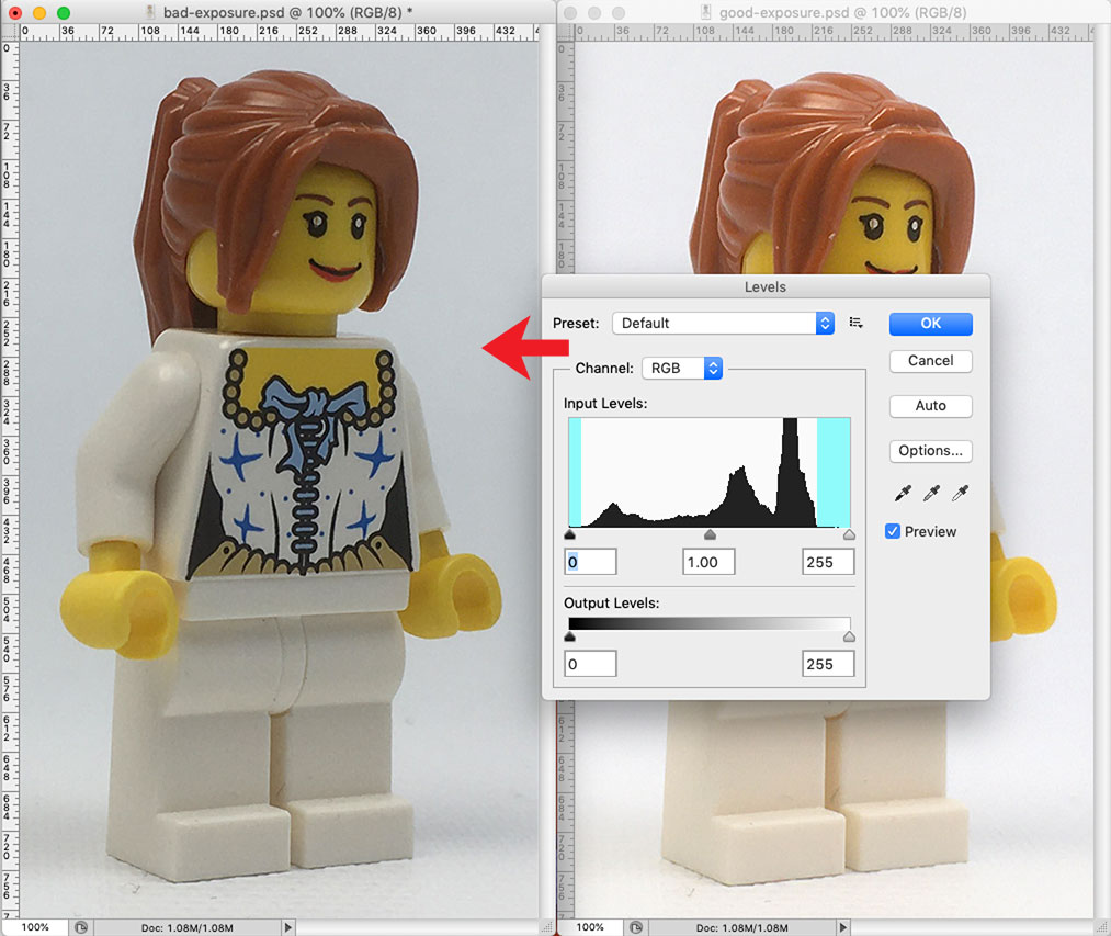
Below left is a split screen view of the two images. On the right, with the bad exposure layer targeted, the white levels slider is adjusted left in an attempt to match the value of the figure at the hips to the value of the hips in the good exposure. To get the values to match, the slider has to be moved far past the edge of the mountain. So, while the value is matched here, if this adjustment is accepted it means that one fifth of the available data in the image will be thrown out.
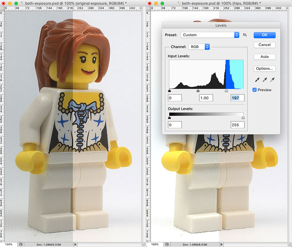
Below left shows the image as adjusted. Below right shows the redistribution of pixels in the histogram. Note there are now a lot of pixels at 100% white and there are gaps in the data as it has been stretched to fit the available range.
Below compares the adjusted image to the good exposure. Note that in the adjusted image:
• the hair is still darker
• blues are still darker
• whites have lost detail on the tops of the feet
• there is no separation between the top of the left foot and the background
• the highlight on the top of the torso is blown out at the corner
• the highlight on the top of the right shoulder is blown out
• definition is lost between the back of the right arm and the background
• the top of the right hand has increased contrast.
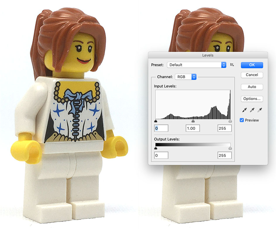
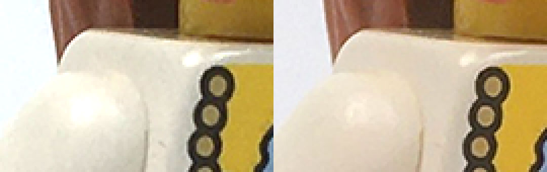
A close-up look at the shoulder area shows the detail that has been lost. The boiling...the lack of smoothness in solid areas of color...is now more pronounced in the adjusted image.
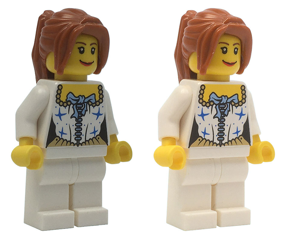
Below is a comparison of the bad image, the adjusted image, and the good image. It may be possible for someone with great Photoshop skills to adjust the bad image into something better than what has been demonstrated here, but that takes time and experience. The simplicity of the fix of adding black cards to the original shot requires far less effort and yields more acceptable if not superior results.
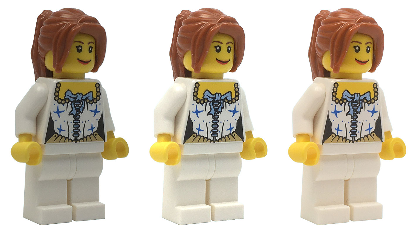
Above left: original bad exposure silhouetted. Center: adjusted bad exposure silhouetted. Note disintegration of right arm and left foot where they meet the white background. Right: original good exposure silhouetted. Note there are many more adjustments that can be made within Photoshop, but nothing is a substitute for a good initial exposure. A better exposure will have more data to manipulate, so it should always lead to comparatively better results in post production.
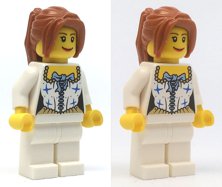
Below is original good image (left) next to photoshop-adjusted good image (right) for comparison. The white of the torso has been adjusted to be less red. Overall it has been lightened very slightly and dust has been cloned out. All edge detail has been retained and highlights are not blown out.